A Hat for an Elephant
The digitisation of a hand written and illustrated children's book created by a relative. Produced using the Affinity Suite.
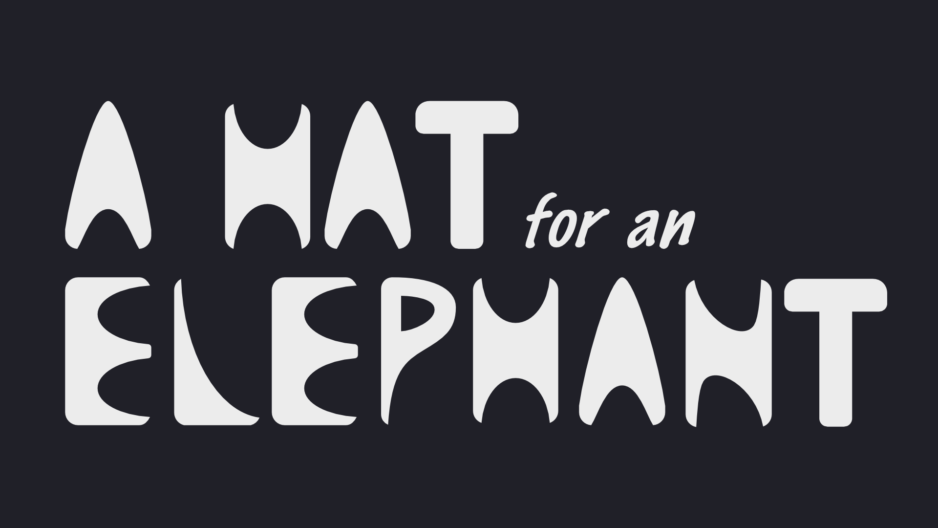
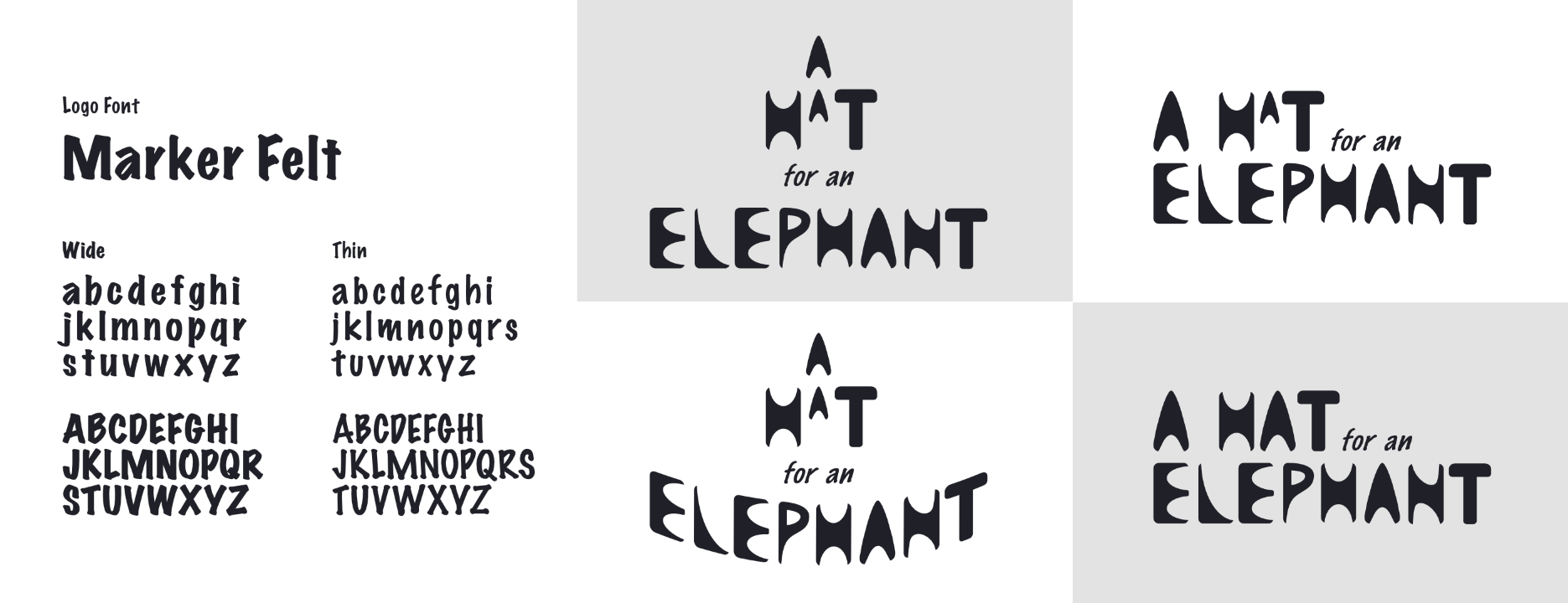
The first task I did when digitising this book was to re-create the logo as a vector object. As each of the letters in the original logo could be derived from combining circles, triangles and rectangles in different ways, I mainly used boolean methods to work out the main shape of each letter.
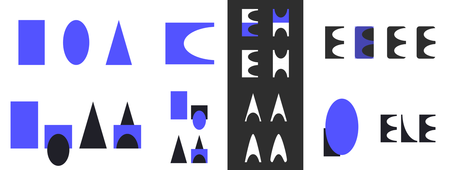
I further adjusted and smoothed out parts of letters using pen and node tools. Finally, I rounded the corners of each letter to soften the appearance of the logo.

Some letters required a bit more finesse, while others were simpler or could be created by re-using existing letters. I accompanied the main logo letters with a typeface for the "for an" part of the logo. The typeface I used did not have a matching italicized font, so I warped it.
Most of the work focused on the 20+ pages of body matter. My relative wanted the handwriting removed and replaced with digital text, but there was some extra work that would need to be done to standardise the appearance of the pages.
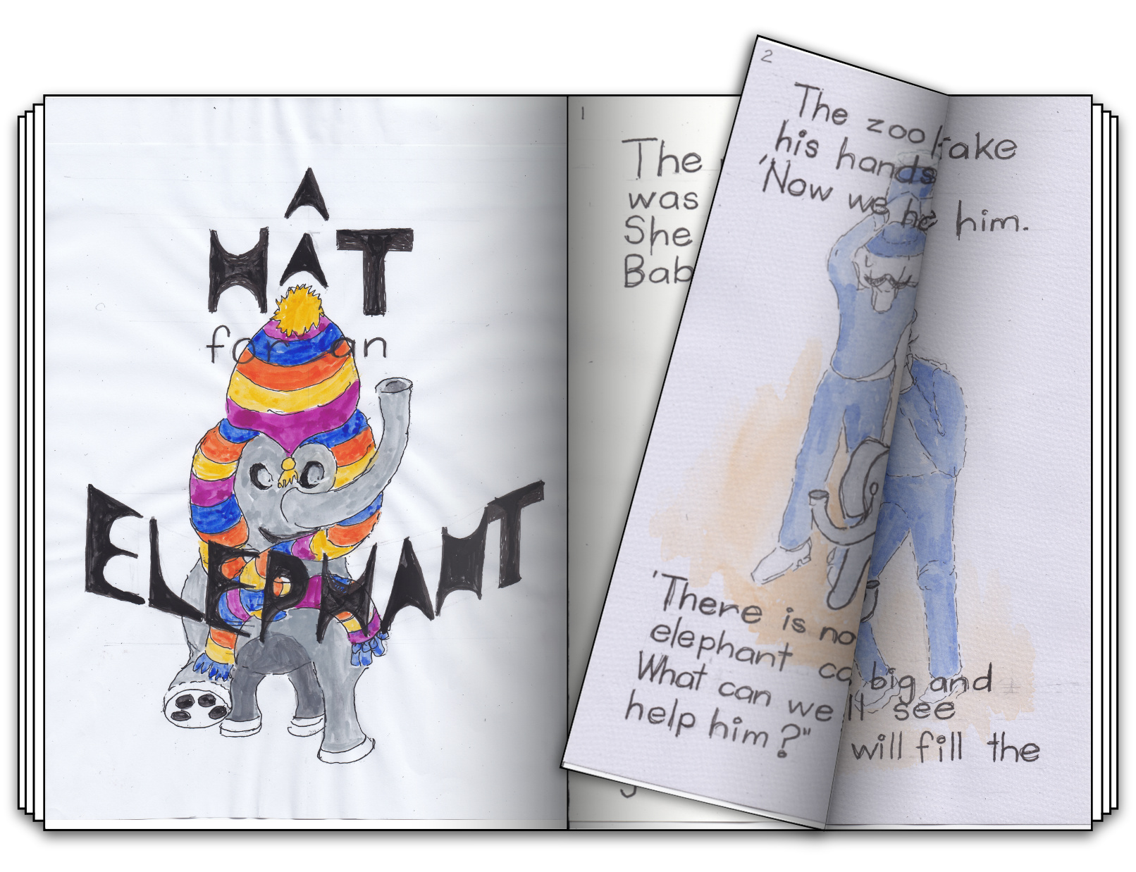
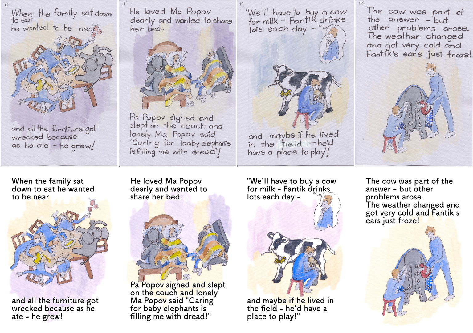
My process started by removing handwriting that covered the illustrations. This was achieved by using different selection and healing tools within Affinity. I would then isolate the illustration from the main page. This was necessary to remove the texture of the watercolour paper, and allow for plain white to be used as the page background colour instead.
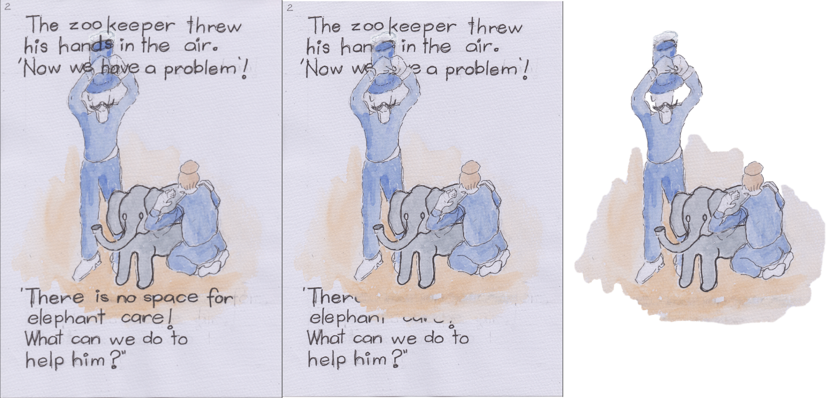
I would also remove any gridlines or pencil marks leftover from the initial lettering. It was important in this process to use healing tools sparingly, to keep the illustrations as close to their original appearance.
Following the isolation of the illustration, it would then need to be colour-adjusted due to the colour of the paper, whilst also having the background blend out smoothly into what would now be pure white pages.
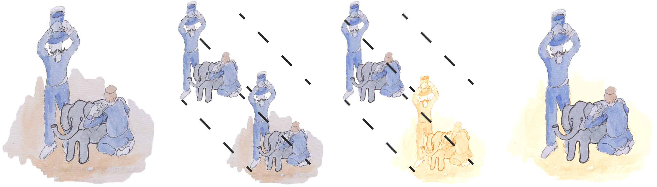
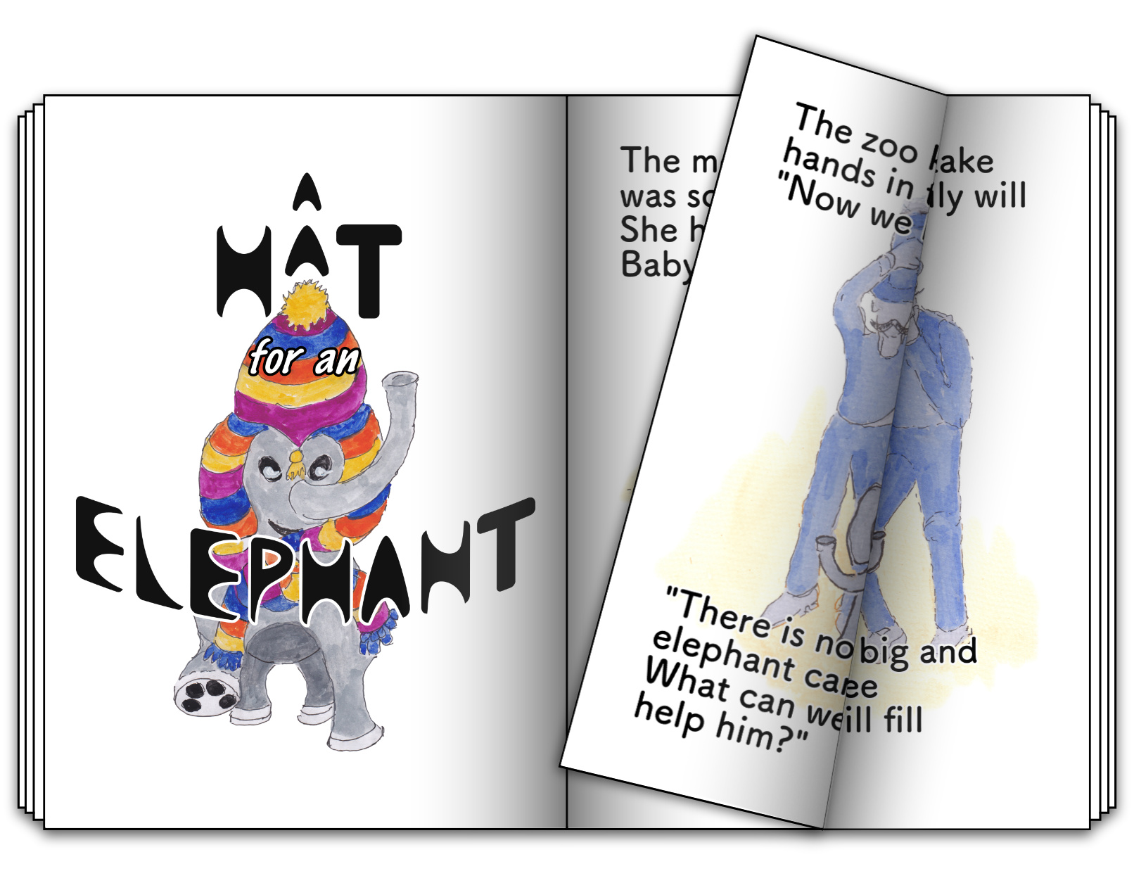
I adjusted the background and foreground separately. I completely re-coloured the background as that was the easiest way to remove the blue whilst retaining the tonal values, and feathered it out to help soften the edges. The foreground received more minor adjustments. The changes resulted in the illustrations being more vivid and brighter overall.
To put everything back together, I first chose a typeface which I felt was similar to the handwriting. Whilst not identical of course, I chose it for its thinness and roundness. With approval, I also added a white outline to the body text to create clarity on overlapping.
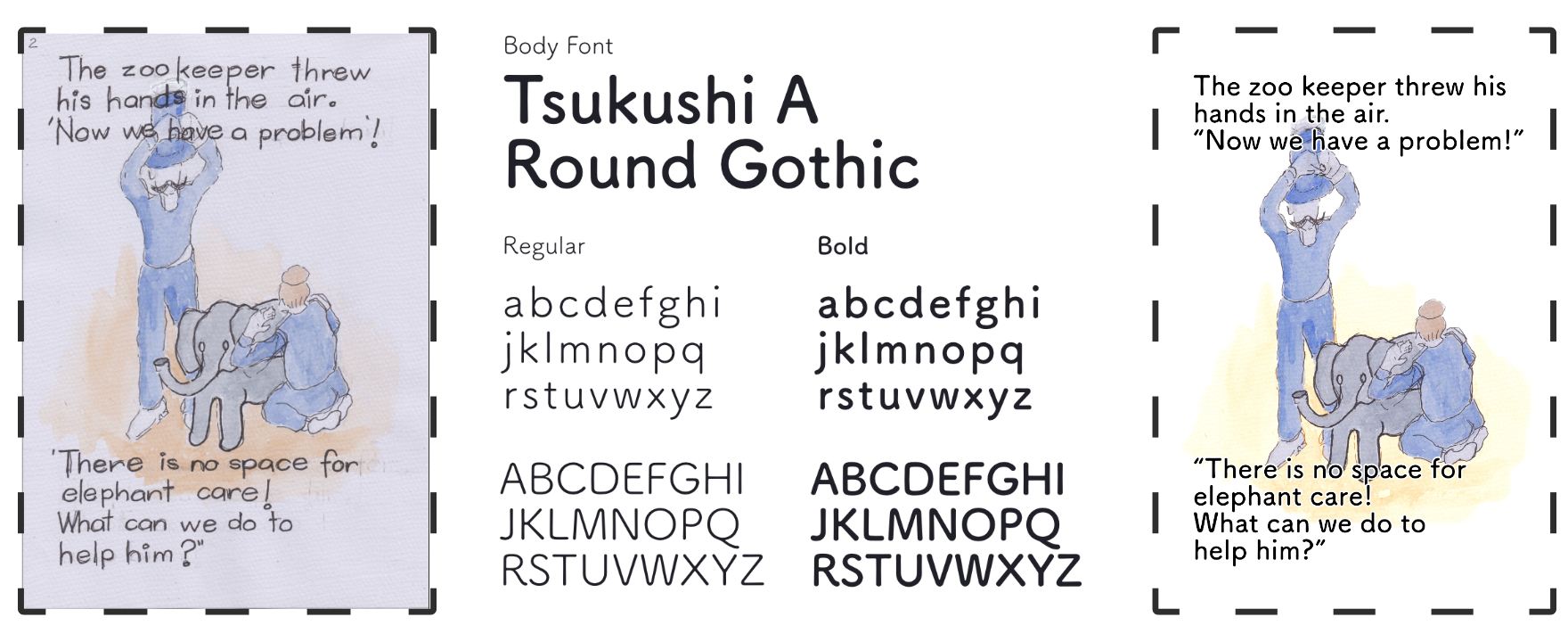
All the pages used the same master page inside Affinity Publisher. This master included a 10mm margin and a 20mm guide on all sides. The 20mm guide was used as the edge for text, whilst the main 10mm margin would be for the illustrations.
See some of the transformations below.
In respect of intellectual property, a complete pdf of this publication is not publicly accessible.